-
gaffnere
ParticipantHi there.
Amazing theme! Thank you so much.
I’m just having a bit of a problem, esp with my mobile site.
I have built 2 nearly identical pinboard sites:
1) and 2).
The former was a test run, the latter is the real one I’m now working on.When I resize the browsers, the two sites behave completely differently – the new site has lost the nice animated responsiveness.
The old site doesn’t crop the thumbnails images for posts on the front pg & category pgs, while the new site does.
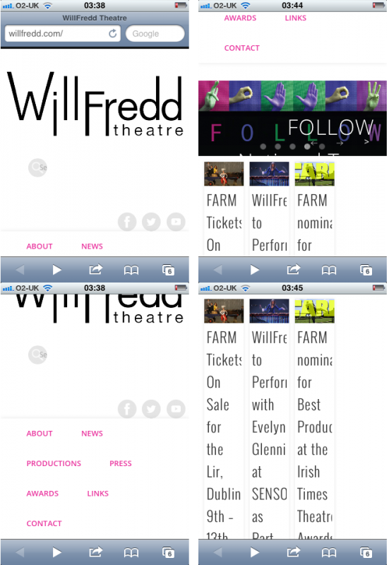
The real one also appears all screwy in mobile.
Here‘s a picture of how the old one looks in mobile and here‘s how the real one looks.I’ve been through the code & can’t find any massive discrepancies which would account for all of this.
Can you please help me? I feel like there must be some setting I tweaked & missed…
Both sites are pinboard 1.0.7 by the way.
Cheers!
Daniel Tara
KeymasterThe easiest thing you could do is move the test site to the live site and transfer the content, that’s the method that in my opinion presents the lowest risks.
The lack of animation is most probably cause by a JavaScript conflict due to a plugin. Also check to see if you have this code in style.css:
.masonry,
.masonry .masonry-brick {
  -webkit-transition-duration: 0.7s;
     -moz-transition-duration: 0.7s;
      -ms-transition-duration: 0.7s;
       -o-transition-duration: 0.7s;
          transition-duration: 0.7s;
}

.masonry {
  -webkit-transition-property: height, width;
     -moz-transition-property: height, width;
      -ms-transition-property: height, width;
       -o-transition-property: height, width;
          transition-property: height, width;
}

.masonry .masonry-brick {
  -webkit-transition-property: left, right, top;
     -moz-transition-property: left, right, top;
      -ms-transition-property: left, right, top;
       -o-transition-property: left, right, top;
          transition-property: left, right, top;
}
There is an option in theme options wether to crop thumbnails or not. After you disable that option you need to recreate the existing thumbnails using this plugin.
gaffnere
ParticipantHi Daniel,
Thanks very much for your response, I really appreciate it.
To be honest, I originally tried to move the test site to the new domain & hosting but found it too complicated…
I’m OK with losing the animation. I just want the new site to show fewer columns as the browser gets smaller. Currently, at the narrowest browser dimension / media screen, the full three columns show, all incredibly narrow. And I’ve lost the #access nav.
Is there any code I can add to make the narrower media screen just show a single column of posts & reclaim the #access?
I checked & the code you wrote above is all intact. I barely touched the stylesheet.
I also disabled all plugins that weren’t in the test site so I don’t think there’s a javascript conflict.
Thanks again for your time.
G
You must be logged in to reply to this topic.