The Enlightenment Theme uses Bootstrap’s Navbar component to generate the page’s header can can be customized using some built-in theme features. In this tutorial you will learn how to add a site logo, add icons and descriptions to menu items, create a mega menu and add widgets to the “Navbar” sidebar.
This tutorial is part of the series “Enlightenment Theme Documentation“. Enlightenment is a powerful theme that can help you create advanced page layouts for your website, but may require a bit of mastering for beginners. Make sure to read all of the theme’s documentation tutorials to get the most out of this theme.
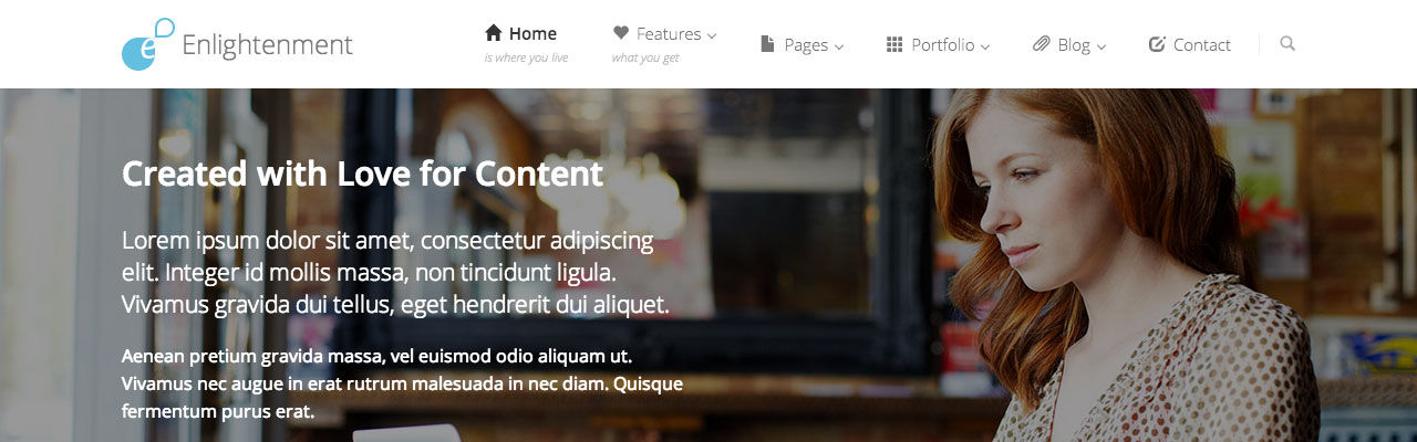
Customize the Navbar Size, Position and Background
Under Appearance > Theme Options > General you can find options to customize the Navbar’s size, position and background color. It can be configured to stick to top or scroll with content, display in a large size with menu item descriptions or a discrete small bar with menu descriptions hidden and use a light or dark background color.
Configure the Navbar Position
The “Navbar Position” option configures the Navbar to stick to top when scrolling or scroll along with content as seen in the screenshot below:

The “Fixed on Top” option makes the Navbar stick to the top of the page when scrolling and the “Static” option makes the Navbar scroll along with content.
Configure the Navbar Background
The “Navbar Background Color” option allows the configuration of the Navbar to display in a light or dark background color:

The “Default” option is the light version and the “Inverse” option displays the Navbar in a dark background color:

Configure the Navbar Size
The “Navbar Size” option configures the Navbar to display in a large version with menu item descriptions visible or a small discrete version with menu item descriptions hidden:

The default “Large” option displays the Navbar with a height of 80 pixels and menu item descriptions visible. When no menu items have no description, they are displayed centered:
If you would like your menu items with no description to be aligned with the menu items with description insert a blind character (i.e. a space) in the description field of your menu items:

The “Small” option displays the Navbar in a discrete 60 pixels version with menu item descriptions hidden:

When using the “Large” Navbar with the “Fixed on Top” option, checking the “Shrink Fixed Navbar when scrolling” option makes the Navbar shrink to the small dimensions when the page is scrolling and display in the large version only when the top of the page is reached.
Add a Site Logo
In the WordPress admin, under Appearance > Theme Options click on the tab called “Logo” to open the Logo Uploader interface. Here you will see options for uploading a logo image, setting the image’s dimensions, cropping it to exact proportions and hiding the header text. Here’s a preview of the interface:
Clicking on “Upload Logo” will open up the WordPress Media Uploader where you can select an existing image from the Media Library or upload a new one:
With the standard settings the logo will appear in the website’s header, next to the site title. Regardless of its dimensions, it will automatically adapt to fit the header’s container. Here’s are previews of the logo in both the large and small navbar:
Large Navbar
Small Navbar
The default logo image dimensions were selected to fit best in the header’s container. To avoid unintentional cropping when uploading an image of different proportions, it is recommended to change the dimensions in logo settings to match the image’s exact dimensions. Even if the hard cropping option is turned off, WordPress’ image resize function might still apply a soft crop on your image.
A real life example is to add a logo image with text and hide the site title. Below are the settings a logo image of 64×240 pixels with the “Hide Site Title Text” option activated:
And how it is rendered on the front-end:
Large Navbar
Small Navbar
The “Crop Logo Image to fixed Dimmensions” option will apply a hard crop to the selected dimensions if the image is of different proportions. You probably don’t want this but might come in handy in some edge cases when getting the image to fit the header container makes it look distorted.
You can uncheck the “Automatically insert Logo in Site Title” checkbox if you want to temporarily disable the logo without losing its settings or if you want to manually insert it in another location using the <?php echo enlightenment_logo_image(); ?> call.
Add Icons to Menu Items
The theme integrated Bootstrap’s Glyphicons Halflings with the menu editor to allow you to select an icon for each menu item. In the menu editor, you will see an additional drop down menu where you can select the icon and see a preview of each available icon:
Icons will appear in the Navbar next to the menu item’s label. They can be added to both the main menu items and second-level drop-down menu items:

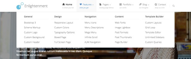
Add Menu Item Descriptions
Menu Item Descriptions are a built-in WordPress feature that few themes take advantage of. We’ve implemented the feature so you can add a description to every menu item and still have items with no descriptions fit just right in the navigation menu.
To add a description to a menu item simply fill in the “Description” field in the menu editor. If you don’t see the field, click on the “Screen Options” tab in the top right-hand corner and check the “Description” box as shown in the screenshot below:

Then fill the “Description” field for each menu item and save the menu:

Menu Descriptions will appear below menu item labels in italics and a lighter color:

Only first-level menu items support descriptions. When the “Small Navbar” is selected or the Navbar’s height is shrinked when scrolling, the descriptions will be hidden.
Create a Mega Menu
Drop-down menus are supported only one level deep. This is because of Bootstrap’s click rather than hover activation of drop-down menus to make them more user-friendly with touch-based devices. Most websites will not need drop-down menus more than one level deep and studies suggest that websites with complex navigation get users confused. There are however situations when you must display an item with a lot of sub-elements like a product with a lot of features. For this we have created the “Mega Menu”.
Declaring a drop-down menu’s parent as “Mega Menu” requires adding an additional CSS class to the item. If you don’t see the “CSS Classes” field in the menu editor you can activate it by clicking the “Screen Options” tab and checking the “CSS Classes” box:

Enter in the parent menu item’s “CSS Classes” field the value mega-menu like below:

Then Build the Mega Menu as second and third level drop-down items of the parent:

The Mega Menu is displayed as multiple columns of menu items. Second level menu items will appear in the first row as the column’s title and third level menu items will appear under their second level parent:
Add Widgets to the “Navbar” Sidebar
The “Navbar” Sidebar is located in the right side of the Navbar after the navigation menu and due to the limited space available has been designed in a manner different than traditional sidebars.
The sidebar has a height of only 20 pixels and widgets are displayed in one line, floated to the left. Widgets added to this sidebar must display their content in one line, so traditional list-based widgets like those that come bundled with WordPress are not supported. Examples of content that this sidebar was designed for are contact information, search forms, login buttons, shopping carts or social media icons.
Below is an example of the WordPress search form widget, displayed as an icon with the actual search form in a drop-down:

Conclusion
The website header is an important element of any webpage. It is the location of the website’s branding and navigation, so it plays a big role for your online image and user interaction. Enlightenment Theme’s apparently simple and clean header has some powerful options to enhance the visitor’s experience with the navigation menu’s custom icons, descriptions and mega menu and also give a personal touch to your website by adding a custom logo.
Please leave us a comment below to share your experience with customizing the theme’s header. Any feedback and suggestions for future improvement is welcome. We hope you found the theme’s header features useful for your website’s needs. Don’t forget to read the other tutorials that cover Enlightenment Theme’s User Documentation.
Hi guys
Love the theme. Is there a tutorial available, demonstrating how to setup the home page?
An in-depth tutorial how the front page was created will be coming. But we need to cover the simple things first before we dive into the advanced ones.
The best theme I’ve come across ever. The Documentation is in-depth. Wow, just amazing.
Love your theme! But I’m not familiar with WordPress, please help to write a simple tutorial about setting up an HOME PAGE look exactly like your Demo site! Thanks for your free theme again!
You can find the tutorial here.
Hi Daniel.
I am thinking about switching from Pinboard to Enlightenment. Only one thing is holding me back: when I am decreasing the width of the browser window, the menu items disappear and gets wrapped into the “other” menu item. When i increase the window size afterwards, the menu items does not reappear. Is there a known fix to this?
Best regards
Laus Sørensen
There isn’t, but if you have a suggestion you are more than welcome to post it here.